Case study · Communication & information design
Making a Statement: redesigning the hospital bill
A hospital bill arrives at the worst possible moment and asks the most of the people who have the least. I led the human-centered redesign of Ascension's paper billing statement — the highest-volume piece of communication the health system sends.
ROLE
Design lead · Research & testing · Information design
CLIENT
Ascension, in-house (Ascension Studio)
SCOPE
Layout · Information hierarchy · Visual design · Tone
TIMELINE
11 weeks, kickoff to handoff · 2020
01 · THE BRIEF
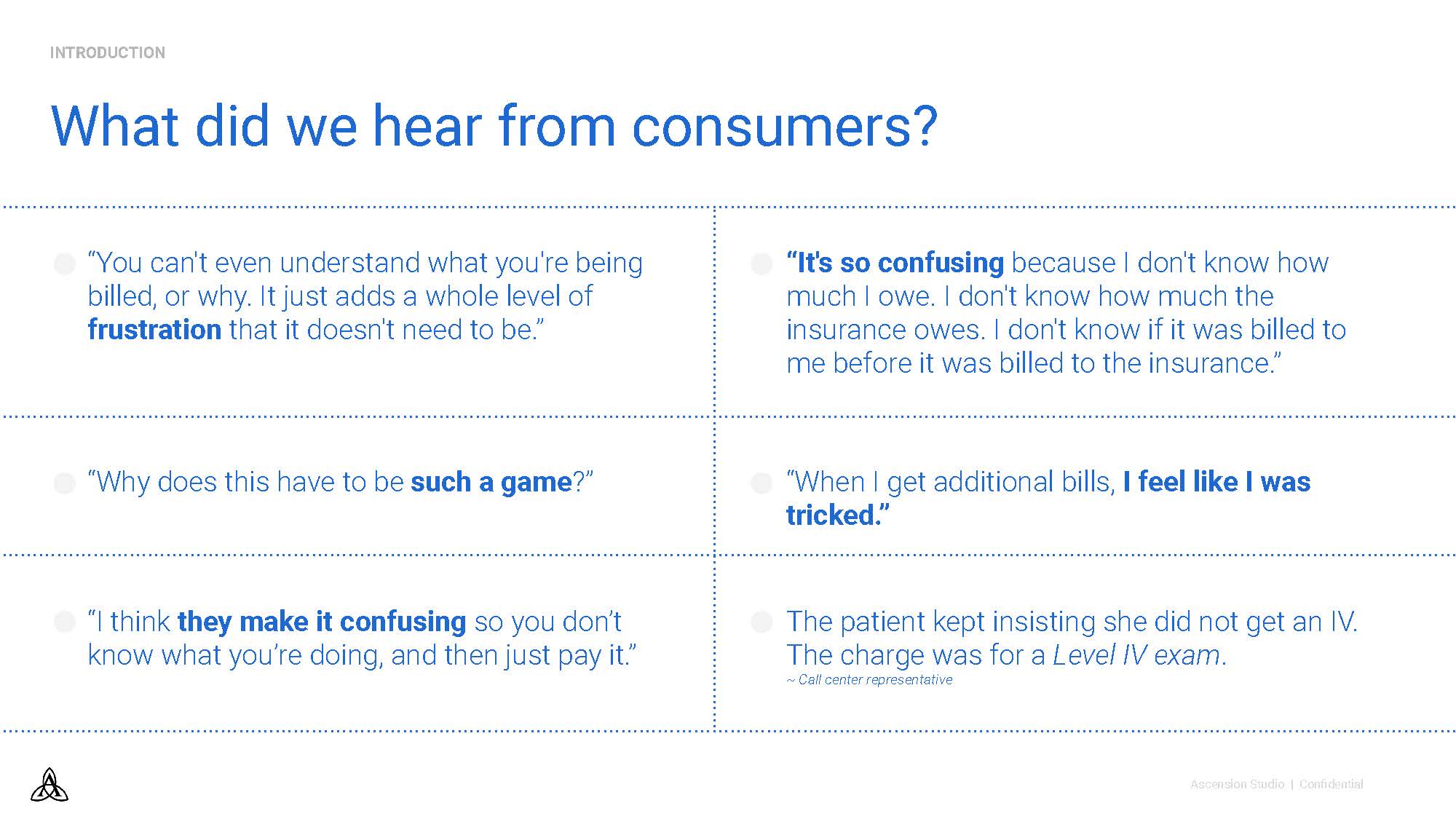
“Why does this have to be such a game?”
That's a real patient, describing the old bill. Consumers told us they felt confused, frustrated, even tricked — and confusion showed up on the balance sheet as call-center escalations and unpaid balances. The objective: a clear, relatable paper bill, grounded in human-centered methods, that helps patients understand their charges, payment terms, and options.
Reduce the confusion that escalates to call centers
Optimize revenue collected
Minimize operational costs
Keep patients informed about insurance collection
02 · THE PROCESS
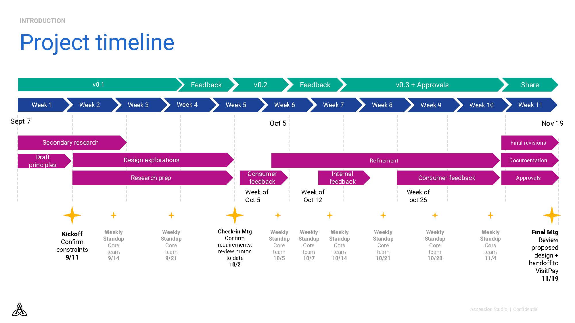
Eleven weeks, three versions, consumers in the loop the whole way.
Rapid, integrated cycles of research and design: hypotheses drawn from prior work, design explorations tested with consumers, internal feedback woven between rounds, and a v0.3 carried through approvals to handoff. Every design decision below survived contact with a real patient.
03 · THE SOLUTION
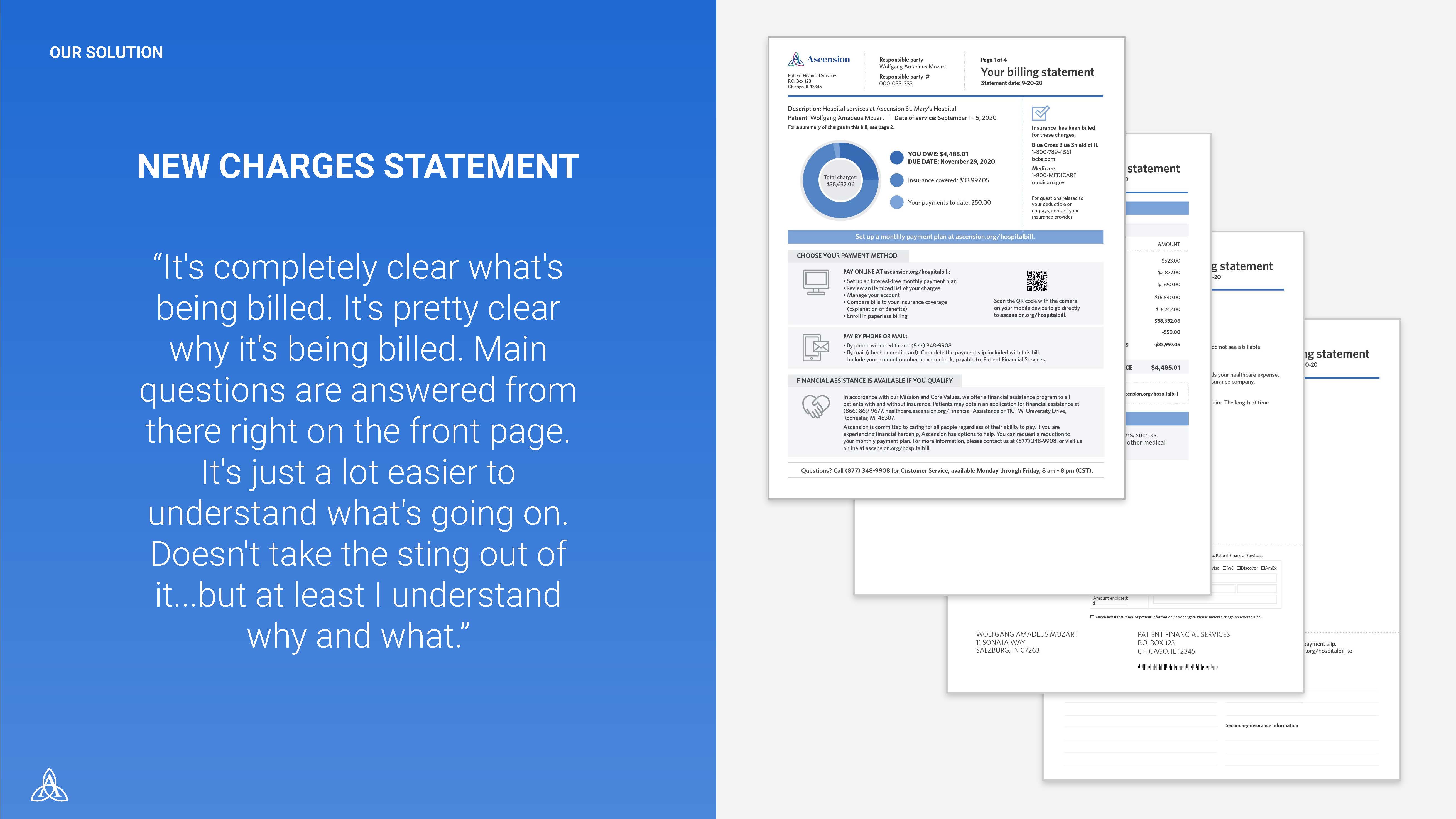
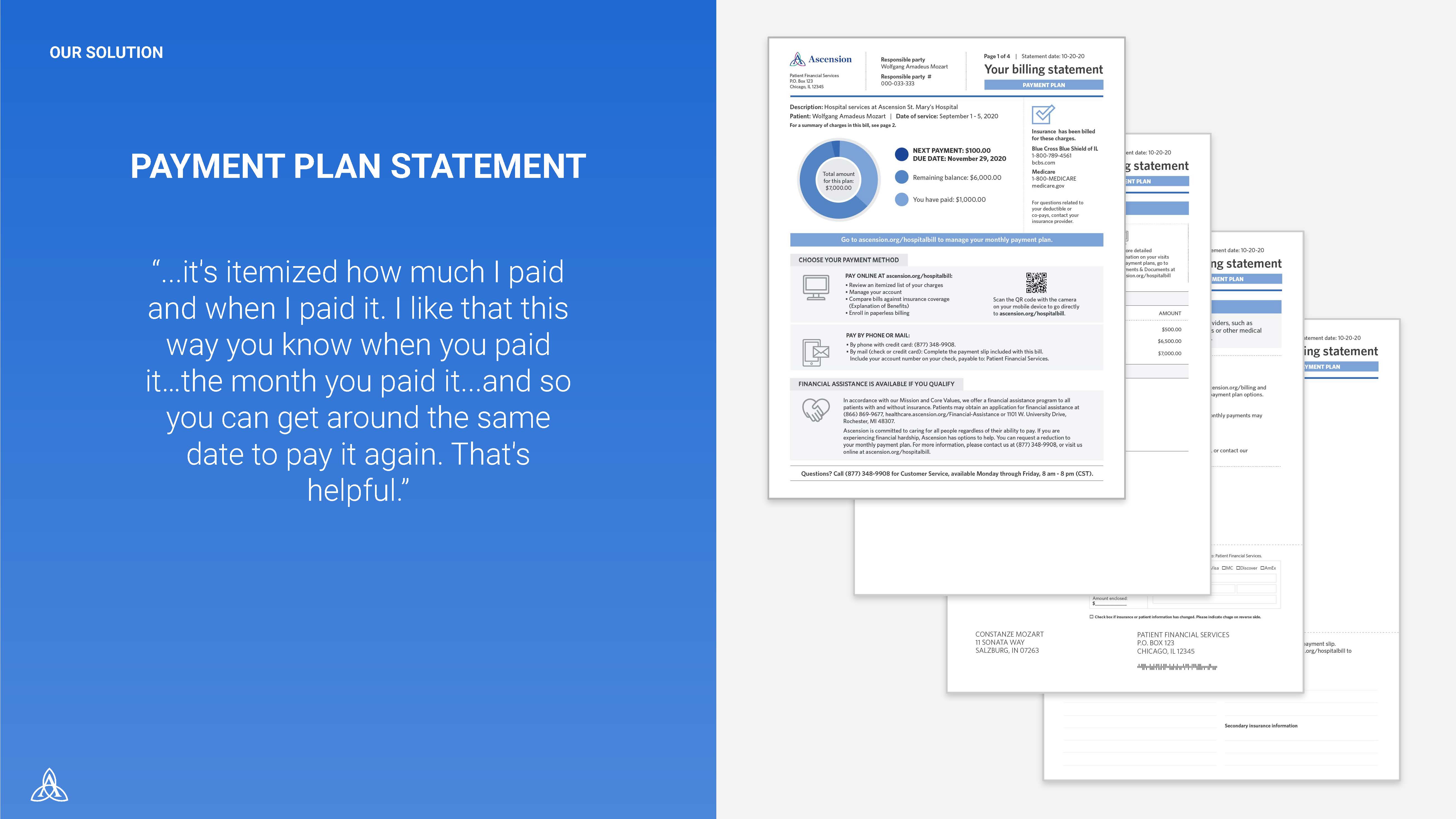
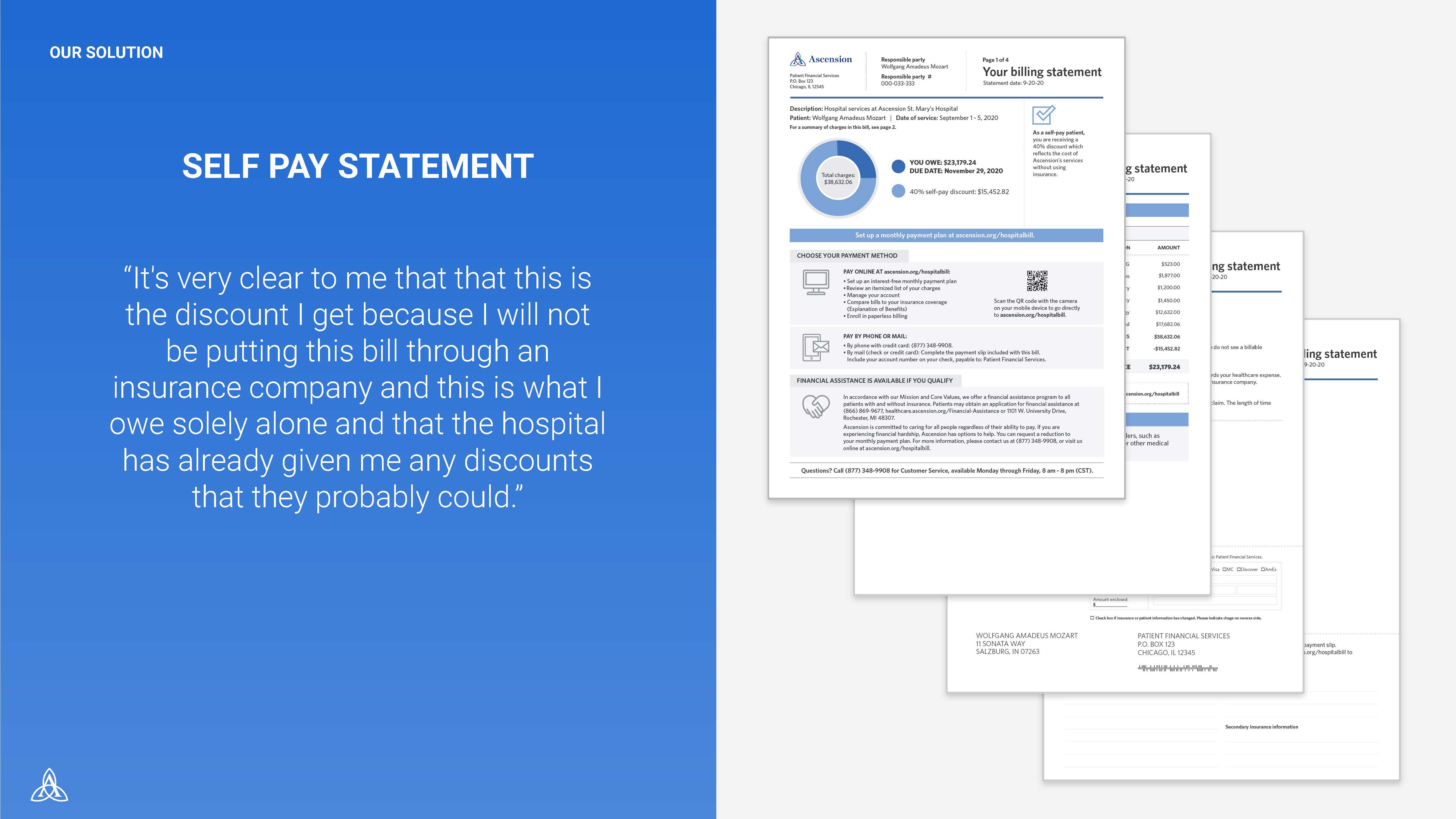
One system, three statements: every situation gets the front page it needs.
A donut chart answers “what do I owe and why” at a glance; charges read as a narrative instead of a code dump; payment options and financial assistance sit on page one instead of the fine print. The same architecture flexes across new charges, payment plans, and self-pay — each validated in testing, in the consumers' own words below.
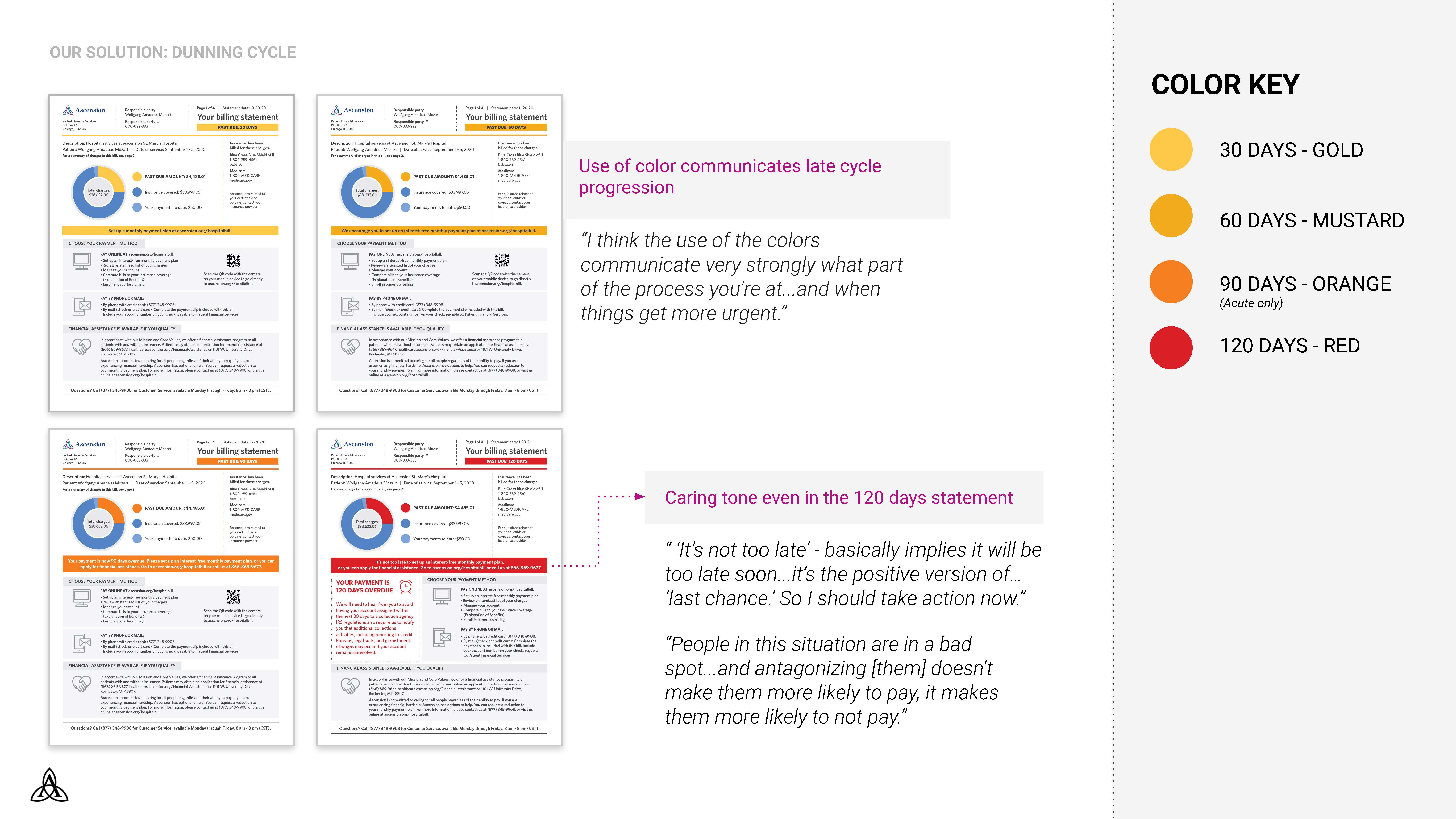
04 · THE DUNNING CYCLE
Urgency by color. Dignity at every stage.
Past-due statements escalate through a color system — gold at 30 days, mustard at 60, orange at 90, red at 120 — so the stage of the cycle is legible before a word is read. The words themselves never turn hostile: even the 120-day statement leads with “it's not too late.” As one consumer put it: antagonizing people in a bad spot doesn't make them more likely to pay. It makes them more likely not to.
05 · WHAT THIS WORK TAUGHT ME
Tone is a financial instrument.
The caring register isn't a courtesy — it measurably changes whether people engage, call, or pay. Writing a late notice that keeps a person's dignity intact is a revenue decision as much as a brand one.
Clarity doesn't take the sting out. It builds trust anyway.
A consumer told us the new bill “doesn't take the sting out of it… but at least I understand why and what.” That's the honest ceiling for a hospital bill — and hitting it changed satisfaction scores. This work later shaped how I approached Grace: same patients, same trust problem, new medium.
© 2026 Marilyn Frank